A Freak ‘On The Road’ To ‘IT’

A Critique of Freaks (the latest art) by Richard Prince

freak:

  1. a very unusual and unexpected event or situation
  2. a person, animal, or plant with an unusual physical abnormality. 
  3. a person who is obsessed with or unusually enthusiastic about a specified interest.

 “I woke up as the sun was reddening; and that was the one distinct time in my life, the strangest moment of all, when I didn't know who I was - I was far away from home, haunted and tired with travel, in a cheap hotel room I'd never seen, hearing the hiss of steam outside, and the creak of the old wood of the hotel, and footsteps upstairs, and all the sad sounds, and I looked at the cracked high ceiling and really didn't know who I was for about fifteen strange seconds. I wasn't scared; I was just somebody else, some stranger, and my whole life was a haunted life, the life of a ghost.” 

― Jack Kerouac, On the Road

Until December 23, 2023Nahmad Contemporary

It is no secret that Mr. Prince has what one might describe as a freakish fixation, a true passion for Kerouac’s Beat Generation defining tome, owning multiple rare and signed copies of the book that influenced the likes of Hunter S. Thompson, Jim Morrison, and David Bowie. What magic serum exists in this book that made countless spirited individuals—freaks all, yet some of the most brilliant minds of our time—take to the road or to their dreams of reaching for the impossible after reading it?  As the Culture Critic Meghan O’Rourke succinctly wrote in Slate about On The Road, it is “a book about death and the search for something meaningful to hold on to—the famous search for ‘IT,’ a truth larger than the self.” 

And herein lies the contextual, comparative-analysis starting line to Richard Prince and Jack Kerouac’s On the Road: Freaks is Prince’s search for something deeper, more meaningful, more truthful and more uniquely, and entirely Richard Prince. Freaks, according to the gallery, are the first works created since 1972 where Prince eschews his lifelong modus operandi of appropriation, of mining through the works of others. As a consequence, per the gallery, these are ‘the artist’s most personal works to date.’ A powerful and enticing statement that induces further inquiry. 

The Kerouac/On The Road connection to Freaks wasn’t visually apparent at first but rather unraveled—maybe a meta-homage to the original scroll manuscript of On The Road. The more time spent observing and experiencing the new paintings the more mysterious they appeared, the more alluring they became. Like the pull of the road for Sal Paradise. 

While the paintings are the star, the show consists of about eighty ballpoint pen drawings on paper, variations all, of fantastical, imaginary caricatures much like and even perhaps inspired by (consciously or not) the ‘inked’ indigenous Polynesian Maori Warriors in the throes of battle cry. While fun and interesting they are mechanical, technical like the creation of a woodblock print. And while the repetitive, linear mark-making creates a tribal-folk dynamism, there’s no meat on the bones, so to speak, having little else than what exists topographically. But the sheer number of drawings and the manic attention to detail highlight what many modern-day shrinks would label a behavioral disorder bordering on the obsessive/compulsive. In Kerouac’s day, long before woke culture, this was simply called discipline and having keen attention to detail. 

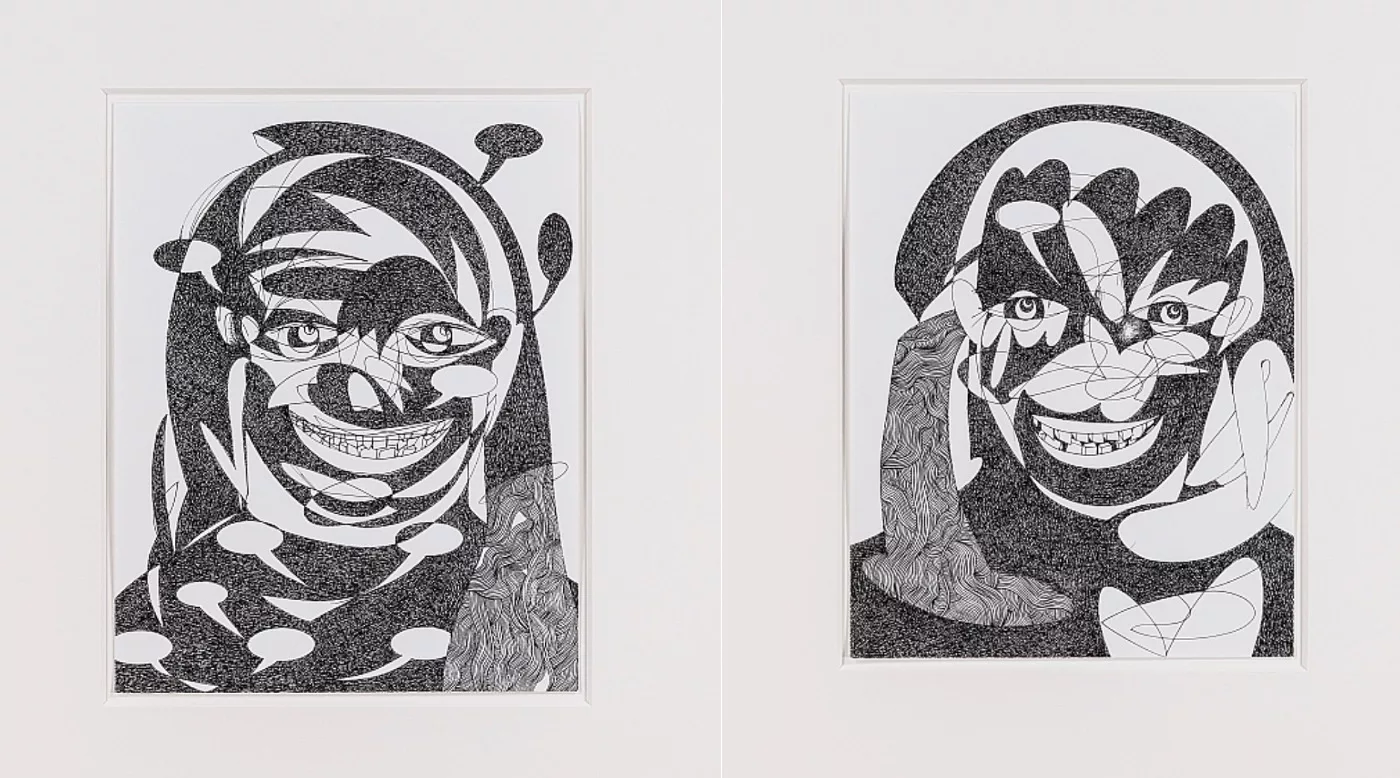
More interesting, however, is the fact that these drawings were created during COVID, a very ‘distinct time’ indeed, and done so at a rate of one per day over the summer of 2022 when normalcy and freedoms were oppressed, stifled as if forcing our mouths covered would silence them as well. Putting that nightmare behind us, we can now openly smile without a facemask at these whimsical drawings laughing and smiling at us, taunting even, and envision Mr. Prince working feverishly (as Kerouac did while writing On The Road) just to keep from going absolutely effing mad in a world turned upside down. Crazy-ass times make for crazy-ass drawings. 

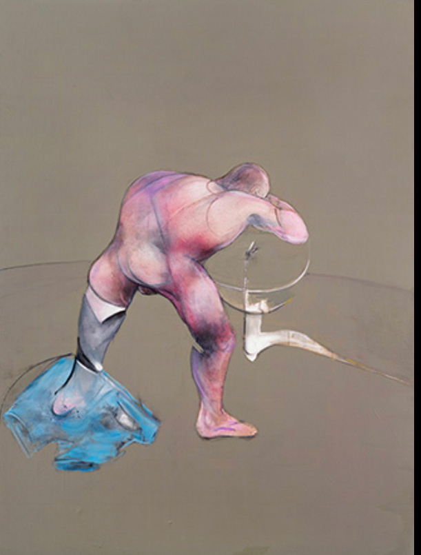
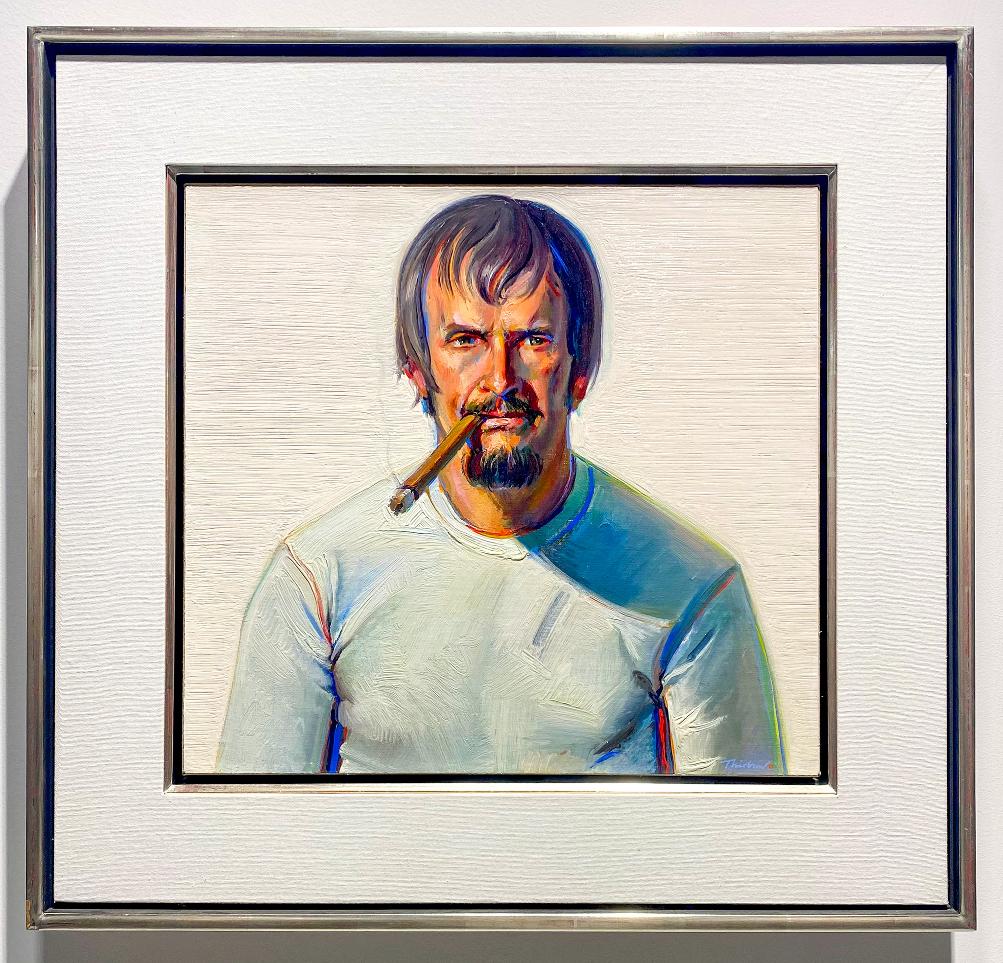
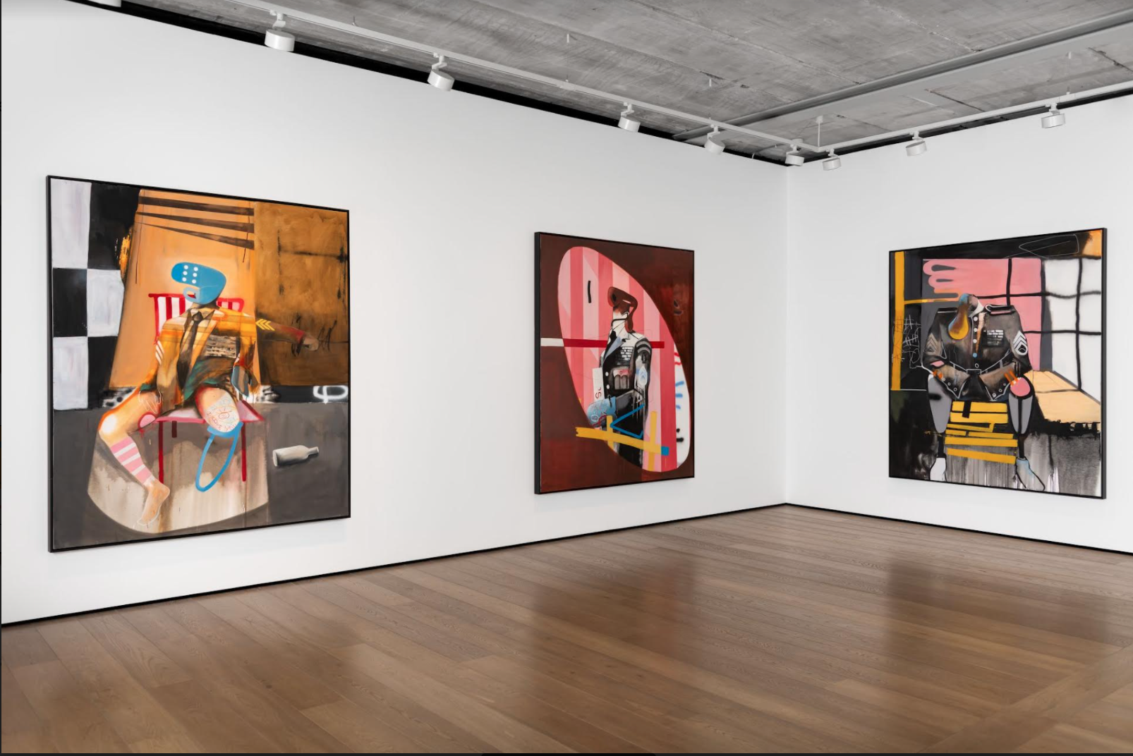
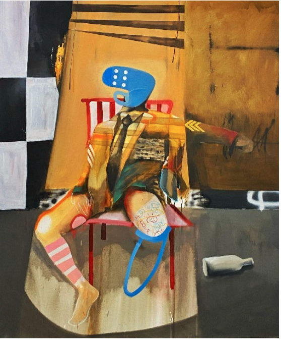
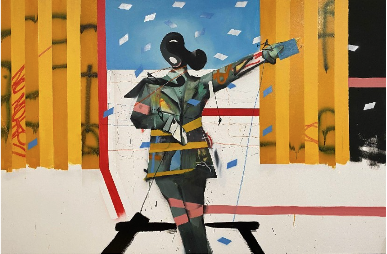
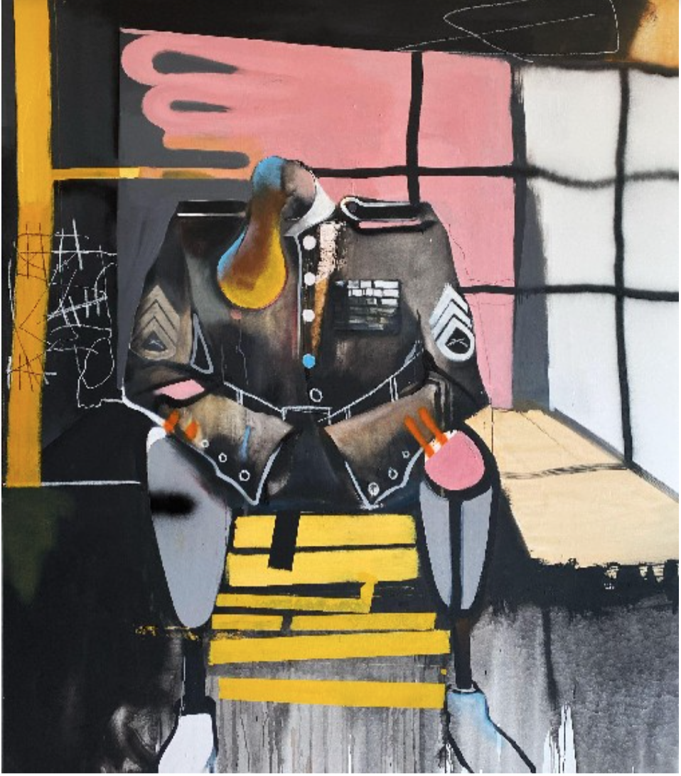
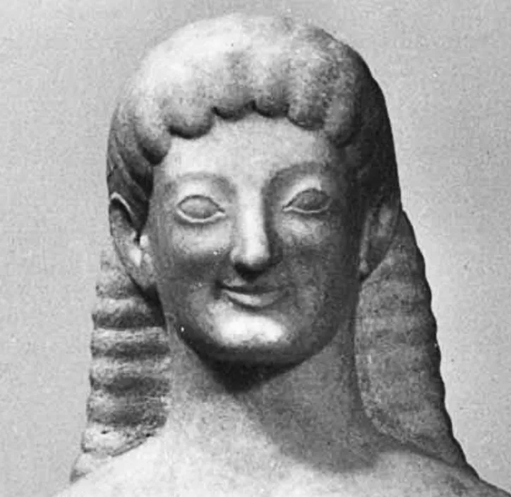
Turning from the drawings, we return to the coup de gras of the show, the eight paintings that elicited immediate attention from viewers upon walking into Nahmad Contemporary. Each painting depicts a solitary, defiantly stark figure standing in a manner that piqued the senses as might a lone hitch-hiker on the side of a dark road. Oddly, the paintings look nothing like the drawings, no trace of a Maori Warrior, no obsessive filling-in of empty space with oodles of lines. And where the drawings mostly depict unabashed smiles and laughter, pure and exaggerated, the smiles here are half-hidden ‘archaic smiles’ like those found on Archaic Greek statuary from the 6th century BCE and covered in part not so much by a strange hand with strange fingers but rather by a more otherworldly, obtuse, geometric shape mimicking a starfish or castle. At first glance, the figure looks as if it's picking the nose that doesn’t exist or giving the viewer a large, middle finger. 

6th Century BCE Archaic Greek Sculpture (archaic smile)

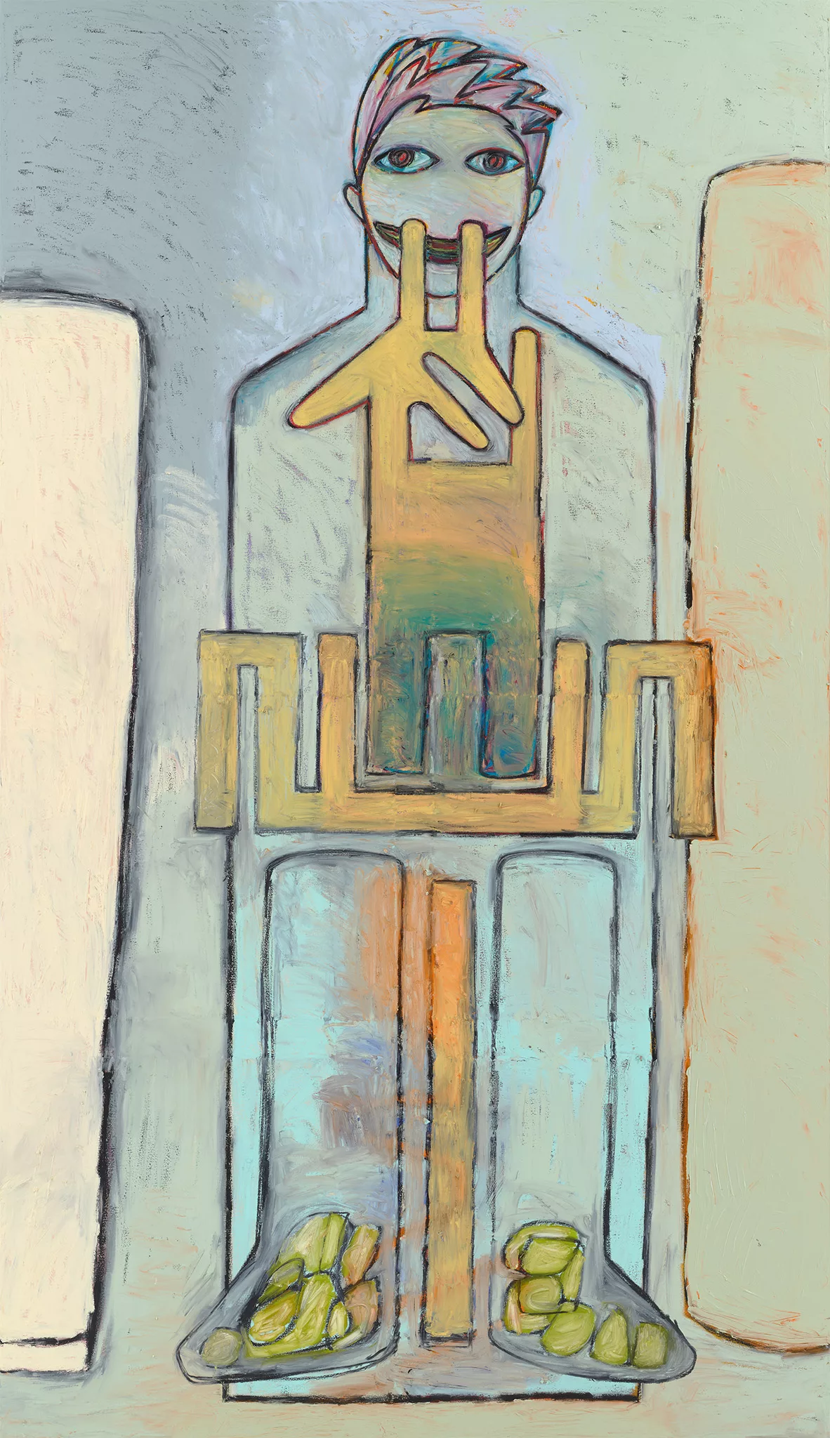
Unlike Prince’s earlier, single-figure, film noirish Nurse paintings (mouths also covered—oddly premonitory—with surgical masks) that would have made the perfect companion poster for a Hitchcock horror movie, Freaks is neither pulp nor kitsch.  And on a purely technical, materiality level, they are far superior. The artist’s hand, his touch, his fingerprints—not just his idea—is evident everywhere. Even though the catalog states that oil, acrylic, oil stick and collage (for some) are used in these works, it is the pure color and nature of the oil sticks that seems to dominate the finished, painted works. Unlike when a brush is used, where there’s a stop and go motion in the paintings process because the artist has to keep dipping the brush into globs of paint set out on the palette, the oil stick is ready-made filled with pigment, like a loaded-up tank of gas, which allows for a continuous, non-stop movement and flow, and this flow is what permeates the picture’s vibrational tones. The flow here is like a jazz beat and it’s authoritative, improvisational, skating and skimming spontaneously over the entire surface, delineating the forms and shapes of the figures, and the wet-into-wet blending of color, and the color over color (the chroma is rich and lush) with background treated gesturally and only alluding to more shapes with more color which in turn amplifies the mystery while helping to convey and elevate the most startling aspect of these new works: their overwhelming sense of sadness. This was unexpected.  Images of the series online (which always deceive) gave the work a silly, cartoonish appeal. The yellow pigment recalls Bart Simpson’s pigmentation and the exaggerated body parts furnish its comic look.  Yet there is a discomfiting relationship between weight and the air about these single-figures, an essence truly haunting, ghostly, perplexing; Perhaps at the base of the complex of sensations exists a melancholia of the sort found throughout On The Road, which begs the question: Richard, is this you? 

Freaks, we are told, began with a series of heads the artist created with ballpoint pen back in 1972 and were—according to the artist—“the first things I did that ever had any soul.”  Why, then, did Prince abandon them for so long? The Press Release from Gagosian Gallery’s 2018 High Times show stated: “when Richard reached NYC he wasn’t interested in anything to do with feelings, especially his own. He wanted nothing to do with himself. He wanted to change places with someone else, even just for a day. Just to see what it would be like to be someone else.”  

Kerouac’s words in the epigraph now start to rhyme: “.…and really didn’t know who I was for about fifteen strange seconds. I wasn't scared; I was just somebody else, some stranger, and my whole life was a haunted life, the life of a ghost.”       

Prince was ghosting himself.  He tapped into something early in his career only to avoid it for fifty years. The artist elaborated that he wasn’t ready back then to make art “with my own blood.”  Apropos, for fifty years, Prince has lived a vampiric life, preying on (mining) the work of others to continue flourishing. Even ballsier still, creating art, he says, that he could “get away with.”  Such an existence, no matter how successful, must be exhausting for one’s soul if not entirely deadening to it. Plus the constant lawsuits, the negative press, the constant battling-it-out in the public arena with all the haters on social media must take a toll. The draconian lockdowns were well suited for self reflection and introspection, an opportune time to question one’s raison d’être; whereby during a time of social quarantine, the self is all you have. Prince, obviously, took the time to dig up those first recorded remnants of his ‘soul’ in order to breathe a different and perhaps more fulfilling spirit into his new work. 

Historically, it was a black and white photo of the Abstract Expressionist painter, Franz Kline, in his 14th street studio peering out the window that Prince saw as a young man which propelled the artist to move to New York some fifty years ago. The artist described the photo as “a man content to be alone, pursuing the outside world from the sanctum of his studio.” But with these paintings, Prince was no longer pursuing the outside world. He was, most certainly, and finally, looking inward, pursuing his own world. But what was he feeling? 

An emotional and jarring disconnect exists in all the works—all of which are labeled Untitled—between the half-hidden smile and the eyes. These are not smiling eyes, these are sad and wild eyes, these are zombie, apocalyptic eyes, these are eyes that have been on the road for too long, have seen too much, have partied all night, have lost sleep; these are far away eyes and are the eyes to the characters in On The Road who never found what it was their sad lives were looking for—if they ever even knew what it was they wanted when they went searching via the road. The absence of a nose in all of the paintings accentuates the disconnect between how the eyes read and the enigma of a smile masked by confusion.   

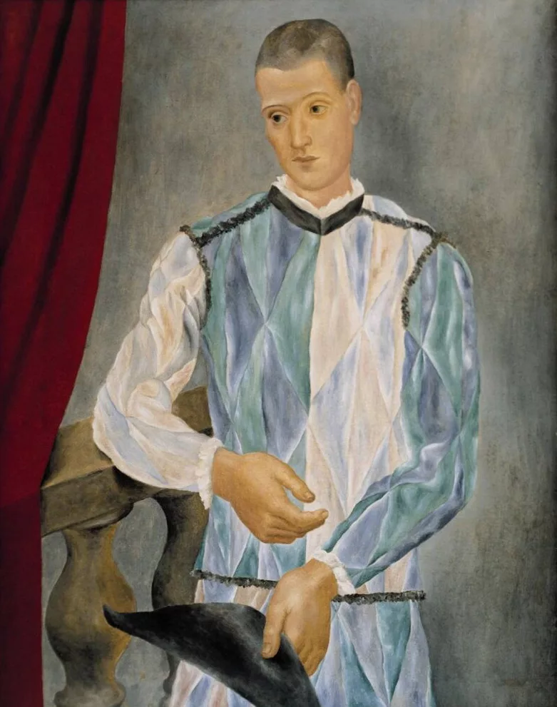
According to the gallery, the painted works are ‘kindred with Picasso’s harlequins.’ This is true on one level: harlequin comes from the 16th century French word for demon, hellequin (note the first four letters of that word) whose role in the French courts of the time was ‘to trick and deceive people, to keep them off-balance, guessing and confused.’ Body language is less difficult to comprehend. Covering the mouth with a hand can indicate an effort to hide dishonesty or deceit. While clasped hands as seen in many of the works is often a sign of being self-conscious and is an expression of nervousness, apprehension. It is also a sign of being defensive as Mr. Prince has had to be throughout his entire life (at least vis-a-vis his lawyers and gallery). Or, just as a harlequin would, the artist is mocking his detractors. 

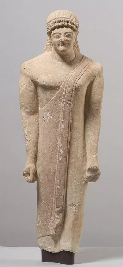
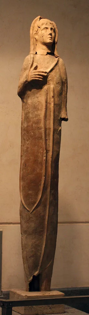
But on another level, pictorially, the figurative paintings fall more in line with the ‘anatomical votives’ of classical antiquity—statuary votives made for, and as offerings to, the divine. Compositionally, the figures by Prince, more figurine than anatomically correct body, are stoic in form with a rigidity more stone-like than fleshy and constructed as if with building blocks or Legos, legs and arms compartmentalized into solid, rectangular slabs of paint all neatly ensconced between what appears to be two pillars, two monoliths of varying color. And we are reminded yet again of what Kerouac said of the Beat culture: “it implies the feeling of having been used, of being raw. It involves a sort of nakedness of mind, and ultimately, of soul: a feeling of being reduced to the bedrock of consciousness. In short, it means being undramatically pushed up against the wall of oneself.” 

Every single one of us who survived and lived through COVID were metaphorically pushed up against the wall of oneself. We were at our wits end with the rules, the dictates, the deaths, the illnesses, the mandates, the shutdowns, the requirements, the school closures. Of course Prince would paint wild, dark, bewildering and crazy eyes. And are not these figures being pushed between two walls? Are they not reduced to their simplest forms and undramatic (as opposed to the dramatic representations of the artist’s Nurse paintings)? Are these not raw and naked representations of the artist’s true self, of his soul? Prince has said, “freaks are something between a monster and a friend.” On that, we are all freaks struggling between the good and evil within, constantly walking a line of sanity and lunacy, between nothingness and paradise, in a world appearing more insane by the day, inhumane; where both kindness and wickedness hide behind the same face, behind the same thin veil of honesty. These latest paintings by Richard Prince act as stimuli for thinking outside the box, for dreaming big, for creating art with no rules or boundaries. Art elevates the mind and varnishes the soul with a magic serum, like the one laced between the pages of On The Road, and has—for millions of people around the world—proffered the countless reasons for living, for being, for seeking, for digging deep, for experiencing, for running against the wind. We are all journeying freaks on the road to ‘IT’. Prince, it seems, got there sooner than most. —Gregory de la Haba

The California Locos

“Artists have a responsibility to their work to raise it above the vernacular.

Rene Ricard, The Radiant Child, Artforum, 1981

To raise one's art above the vernacular is to make monumental what no one could before, to take that which is tangible and forge the unreal; to eschew what's popular in pursuit of the extraordinary. No group of west coast artists––from this writer's perspective––manifest the words of the late, great art critic, Rene Ricard, better than the California Locos, artists who helped inaugurate the California-as-brand lifestyle as spectacularly as the Beach Boys or The Mamas and the Papas with their 1965 hit California Dreamin'. Back when Abstract-Expressionism, Assemblage, Finish Fetish and Light & Space inseminated the Rock, Surf, Punk and Skate culture of Los Angeles in the 1960's and 70's, a new, bastard-like breed of artist emerged and a nascent groundswell of pure native-Angeleno voice started clamoring throughout the entire SoCal urban-sprawl region––around places like Avenue 43 in Highland Park (a no man's land of turf wars and violence, and home to the Avenues Gang) or along the Arroyo Seco, the “dry stream” that runs up and through this Northeast LA hood. Highly individualistic and unconventional, these artists were born with such a countercultural mindset and fervor, with such dynamism and a style completely their own, that the artist––like the art itself––deviated from the easel to the skatepark, from the gallery to the “Locals Only” break at Huntington Beach, from safe studio with brushes to enemy territory with spray cans, from stretching canvases to shaping surfboards; these artists created an art form that characterized and interpreted their SoCal lifestyle like no one before them. Theirs was a subculture born on the periphery of legitimacy, in gangs, punk bands, and surf line-ups, and they rolled fiercely independent, rebellious, and fearless, sporting names like Tourjé, Van Hamersveld, Wong, Bojórquez, and Wisdom, and who were without question equals to their east coast rivals–– think of the likes of Rene Ricard's “Radiant” children Basquiat, Haring, and Rifka. These are artists who upon further DNA testing (and a few record-breaking auctions) will prove beyond a doubt that they are De Kooning's, Ruscha's, Baldessari's, and Hockney's legitimate heirs.   -Gregory de la Haba 

CALIFORNIA LOCOS

Chaz Bojórquez, known as the “godfather of graffiti art,” is considered one of the first artists who successfully made the transition from street to gallery, and is credited with bringing the West Coast style of graffiti into prominence, evolving it from a Northeast L.A. gang-oriented form, into an extremely fluid calligraphic style of international importance. His iconic street image, a stylized skull called "Senor Suerte" (Mr. Luck), has become a seminal icon in graffiti art, becoming known as the first stencil tag a full 20 years before Banksy made the stencil his iconic form. Bojórquez's paintings are in the permanent collections of the Smithsonian, Laguna Museum of Art, M.O.C.A., L.A.C.M.A., and many more. Bojórquez, a Chouinard alum, was prominently featured in the renowned Art in the Streets exhibit at MOCA in 2011, as well as numerous international exhibitions and is known as a primary influence on many contemporary graffiti artists such as Retna, Banksy, and Shepard Fairey. 

Dave Tourjé was born and raised in the culturally eclectic Northeast L.A. of the 1970s and his upbringing amongst the skaters, gangs, and the area's tribal friction plays heavily in his work—his presence as an original vertical skater showing through in the attitude and energy of his iconography. Also a musician, Tourjé was involved in the important L.A. Punk and Post Punk scene of the late ‘70s and early ‘80s. As a member of the influential band the Dissidents, he played shows with Camper Van Beethoven, Saccharine Trust, and The Minutemen as well as many others. Tourjé’s complex, mainly large-scale reverse-paintings on acrylic glass, oscillate between high and low, punk and institutional hegemony, and combine elements through many disciplines, having also attended Art Center and UCSB's College of Creative Studies during the late ‘70s. He was the subject of a one-man exhibition covering 15 years of his paintings at the Riverside Art Museum in 2002. His work has been featured at the Oceanside Museum of Art, the Orange County Museum of Art, and Laguna Art Museum, as well as numerous galleries since 1985.  

John Van Hamersveld is an American graphic artist and illustrator. He created “The Endless Summer” poster in 1966, and designed record jackets for pop and psychedelic bands since the 1960s. Albums include Hotter Than Hell by Kiss, Magical Mystery Tour by The Beatles, Crown of Creation by Jefferson Airplane, and Exile on Main Street by The Rolling Stones. He created the 1984 LA Olympics poster and 360 foot mural, the identity for Jimmy’Z surf brand, and the brand identity of Fatburger. Van Hamersveld’s work is in the collections of the LACMA, MoMA, Cooper Hewitt, and Smithsonian museums. His psychedelic renderings, whether for posters or albums, are widely regarded as some of the best of the form. Yet, what the public may be surprised to discover is just how dynamic the rest of his work is; his output as a draftsman, designer, and photographer continues to be impressive and compelling.

Norton Wisdom has been collaborating with musical ensembles for live art painting performances since 1979. His collaborations with renowned artists include The Red Hot Chili Peppers, Nels Cline (Wilco), Bernard Fowler (Rolling Stones), Ivan Neville, Stephen Perkins (Jane’s Addiction), Llyn Foulkes, National Bamboo Orchestra of Bali, the Disney Hall with Christoph Bull, and the Winter Olympics in Salt Lake City. His live painting performances have touched off a growing international movement of the same type, which he has been forwarding since the ‘70s, and he is known as a prime mover in this growing genre. His formal studio painting practice includes a meditative dialogue with trapezoidal shapes and gestural elements, which he returns to as a formal and continuous response in his evolution as a renowned third-generation abstract painter. His early influences at Chouinard included John Altoon and Emerson Woelffer.

Gary Wong studied under Emerson Woelffer and Matsumi Kanemitsu at Chouinard and was a vital part of the shifting dialogue integral to the formation of West Coast postmodernism as well as surf/skate/rock culture as we know it today, being part of the legendary underground collective the Jook Savages with Rick Griffin, and maintaining as well as tight associations with the likes of Boyd Elder (Eagles), Ivan Hosoi (Hosoi Skates), and Jim Ganzer (Jimmy Z).  His visual language is a sophisticated collage-based paint/draw process that often uses photography, and reflects his involvement in music as well as wider social and political concerns. His process combines his formal approach as well as a folk-like primal style. Known in the L.A. Blues scene as “Charlie Chan,”, he is a legendary presence as a well-known bandleader, gigging regularly throughout L.A. Close friends and associates have included artists as diverse as Al Ruppersberg, Doug Wheeler, and Terry Allen.

DIVINING THE MAGIC NUMBER

THE NEW PAINTINGS OF GREGORY de la HABA

Essay by David Gibson

The approximation of value is a human activity on the same par with academic reasoning or artistic endeavor. It’s something that’s been a part of human nature for as long as humanity has existed. The determination of value according to the amassment of numerical facts to match material and chronological circumstances in the contexts of different persons, communities, and societies leads us inexorably into a competitive situation; yet there are also spiritual and aesthetic aspects to this quandary that challenge us to advance ourselves. In order to greet the terms of this challenge on equal terms, it helps to have an object representing quality by which to gauge and express the result. It helps even more if the object is immeasurably complex or idiosyncratic. In the new paintings of Gregory de la Haba we have an exemplary model of objects for reflection. They are both paintings of real objects taken out of an everyday narrative and symbolic embodiments of the transformation of human agency, luck, and fate that movement between places and values can bestow. They offer us beauty and mystery in their mastery of significant form.

"Triple Play Sevens" by Gregory de la Haba

De la Haba has a particular fascination with numbers. He finds them along the route he takes each day. They are simple address numbers, often affixed to a doorway in a haphazard fashion, the doorways themselves festooned with graffiti tags that may also include numbers. Larger wall-based graffiti features numbers portrayed dramatically, often referencing a number of personal significance. They may refer to a sports figure’s team number, or something less ubiquitous: an auspicious date, one’s age, number of children, and so forth. Personal numbers have an affinity with accidental ones in that, for one reason or another, they can achieve a magical vibration.  The numbers that de la Haba locates in his paintings are, by their very association, historically magical, the manner by which they have been promulgated in popular culture attaches them specifically to the activity of gambling. This pastime is symbolically loaded and carries a near cult appeal. The dynamics of chance in determining a degree of luck, and therefore of fortune, is something that we can only surmise has charismatically suggested the necessity for these paintings.

De la Haba has combined two different experiences as the symbolic framing device of his new series, doors as portals to alternate dimensions, and numbers—especially numbers emphasizing the Power of Three, as codes and spells allowing entry into these doors. Like Ali Baba saying “Open Sesame” the repetition of a number works like a prayer, like saying Holy, Holy, Holy. It is the emphasis of the specific number with the punctuated phrasing of its sound and name that gives one charismatic magic. De la Haba hopes to give himself a measure of that power by combining the depiction of those triple sets of numbers with an image of himself, shamanistic and empowered. Perhaps he’s collecting numbers, stringing them together to complete a secret code that will ensure his success in the future. Because numbers are not a language in and of themselves but can be made to serve various systems of thought, they are the perfect medium.

"Jackpot 4 Duende" by Gregory de la Haba

JACKPOT 4 DUENDE depicts a door literally covered with forms and words, a single number ‘4’ affixed at its center above where an eyehole would be. Above the number in carnival style lettering stretching upwards at the ends like two wings, is the word JACKPOT, and below it, in a tagger’s script, is the capitalized word, Duende. Below the word, like sentinels at the door of a castle or temple, are two images of green-glowing harlequins modeled after the artist’s youthful club kid friend Muffinhead. Between them are the words “Fucking LEBOWSKI” in red. The first word we can understand, it means the greatest amount of possible luck, a victory in achieving success in gambling. It could also be stretched to a meaning equal to Eureka, meaning a stroke of success in the discovery of any ardently hoped-for result. ‘Duende’ is a little stickier, for it has no exact translation from its original Spanish. The poet Federico Garcia Lorca used it often to infer the feeling of an overpowering emotion, meant as the transmitter of poetic and therefore existential truth, and the power, or spiritual current that put the truth itself into play. To utter the word duende itself is to speak of spirits and the pure power of inspiration, like the invocation of a prayer. The reference to Lebowski is a filmic one, a character who’s a charismatic loser, an everyman type like Willy Lowman in The Death of a Salesman. He loses but does it with style, and only because he risks everything to win. De la Haba is here crossing boundaries to take his cultural earmarks from visual sources that also possess an archetypal affinity with his own character and aspirations.

LAZY EIGHTS presents a door and the brick walls of the outside of the building over and around it in a greenish cast with a stylish graffiti of mawkish faces gazing at visitors and passers-by. Falling all around and over the faces are many small colored specks, round like glass marbles, though they could be confetti, or gumballs, or technicolor hail. They form a scrim complicating direct perspective. Before them, rising like spirits or electrically charged particles, are three bendy number-eights. They give the impression of being ghostlike, as if the number inferred in each one is a separate person—an eighth child, a member of a sports team, or someone who was born or died at the age or on a day marked by the same number. The three soundings of the same number are like intonations of a wish or a prayer, spoken for effect. Three spirits named 8 rise mysteriously as if through dimensions and are momentarily visible, like flotsam blown in the currents of the wind. They reminded me of the soul of a recently deceased person giving up its mortal weight and rising slowly to heaven.  The expression in the title actually refers to an air pilot’s test of appropriate mastery in using the weight and impulse power of the plane to drift through wind currents and rise into a situation of defined control. Luck (or its metaphor, Grace) is often achieved by giving up control and letting the winds, or the wings of angels, carry us.

"Life Gives Sevens" by Gregory de la Haba

LIFE GIVES SEVENS is another powerful work from the new series. It presents a sequence of interlocking symbols that includes the three numbers of absolute charismatic power, numbers that being prime, and uniquely only divisible by themselves and the Number 1. That’s like saying they are the same number, a further imprimatur of essential importance. To say one is seven is, in the contemporary parlance, the same as being a unicorn or a snowflake.  Utterly symbolic and likewise utterly unique. Framed below the three sevens, which in the way they are depicted, seem almost like a halo or a crown upon the image of the artist himself as he appeared in a painting from several years before: primordial man, clothed in the hides of animals, like a Viking king, his posture solid and resolute, his eyes bearing toward heaven or the future. This early model of humanity is willfulness indomitably possessed, man himself as a force against all nature, and all things yet unknown. Such a man might exist for millennia without grace. Yet to be self-impowered and self-fulfilled is enough. His self-image as existential Wildman symbolizes the importance of personal and spiritual growth. Below this image is a Wanted Dead or Alive poster scribbled with the words ‘Powers Pleasant’ and below that the words Triple Play and the trickster-familiar figures of Muffinhead. All around the painting are glyphs of stars painted in spray paint with the starlight oozing like cosmic blood all around the picture, suffusing it with a celestial watermark.

The presence of doors in these paintings cannot be understated. First and foremost, they root the inspired moment in an everyday experience of a city dweller, walking past myriad doorways where some addresses are familiar and many others not at all. The ever-evolving character by which residents of a neighborhood choose to leave an intrinsic mark upon the bleary normalcy of buildings in working class neighborhoods adds to their aesthetic engagement in the random moment. Numbers combined with doorways became the accrued duende that brought these images brooding into de la Haba’s consciousness. Numbers enter our consciousness with a regularity that is immediately disarming. They count streets and buildings on those streets. Our ability to recall specific addresses and place a value, both personal and universal, on certain numbers, is a measure of our ability to grow as human beings. To belong to a place is to assume the value of the numbers specific to it. Say a certain address according to its number and one immediately knows its distance from the center of the city, from the major thoroughfares, and its proximity to important attractions or utilities in the area. Location, as the saying goes, is everything. De la Haba locates the power of inspiration and places it in portals to new knowledge.

Most Fascinating (Paintings) at ABMB 2022

Francis Bacon's Man at a Washbasin at Marlborough Gallery showcases the master painter's prowess and command at his rock-solid absolute best. 

Anne Rothenstein at Stephen Friedman Gallery proves how emotionally impactful the simplicity of line, contour, and shape can be. 

In 100 years, when all the stylized painters of today will be viewed and hung in the same vain as a Watteau or Fragonard, Reginald O'Neil (Spinello Gallery) will be cherished like a Vermeer.  

Who the fuck knew that beneath the strawberry frosted layer cakes and behind the colorful lollipops Wayne Thiebaud was creating other works like the spectacular portrait, Man With A Cigar, at Nahmad Contemporary. 

And Pace Gallery is exhibiting one of Julian Schnabel's latest paintings on velvet. Read an in-depth review of them here: 

Sent from my iPhone

East Villager Billy The Artist Climbs Atop Ai Weiwei’s Fence To Shine A Light On It

The amplitude and potency of art are in its power to inspire and—as the Public Art Fund in NYC does each season staging ambitious, free art exhibitions throughout the city’s urban sprawl—to surprise and delight, as well.  Good Fences Make Good Neighbors was the latest PAF project that did just that. Featuring world-renowned Chinese artist, Ai Weiwei, with curation by PAF Director & Chief Curator, Nicholas Baume, along with Associate Curator, Daniel S. Palmer, the title of this five-borough-wide exhibition is a line taken from Robert Frost's early and very iconic 20th-century poem, Mending Wall, that tells the story of a New England farmer (the narrator) who, with Spring's arrival, asks his neighbor to help in fixing their shared divide, a wall —the sort made of fieldstones placed one atop the other without any use of mortar—separating their properties and which, we learn, had fallen into disrepair from Winter's wrath and or a hunter's trespass.  As the two neighbors begin the mending process, each heaving and emplacing the displaced stones from both sides of their properties,  the farmer-narrator sets forth to question the very purpose of the actual wall standing between them. Sound familiar? The neighbor's only reply: “Good fences make good neighbors.” 

Homage to Ai Weiwei — Washington Square

In this American classic, Frost explores not only the boundaries, demarcations, and offenses walls create but also the beautiful fellowship found in man when working together on a common interest or goal. The poem is an astute study in dealing with life's contradictions, tensions, and prejudices found in society —in one another. As one all too familiar with such themes —and of walls particularly,  especially after getting sent behind four of them in China for political offenses—Ai Weiwei brings an added bonus of authenticity, legitimacy, and profundity to this Public Art Fund project. Inspired by the “international migration crisis and current global geopolitical landscape”, Good Fences is Ai's reaction to "a retreat from the essential attitude of openness" in American politics and a passionate plea "to do more" with concern human suffering, displacement, and divisiveness. Ai Weiwei is, according to this writer, possessed with an art-spirit-magic akin to Gabriel García Márquez and is not simply hacking a line from Robert Frost for mere creative effect but, in fact, becomes Frost's protagonist by questioning issues pertinent to a civil society confronted with, says Ai, a “rise in nationalism, an increase in the closure of borders, and an exclusionary attitude towards migrants and refugees, the victims of war and the casualties of globalization.”  Wei Wei is now the farmer-narrator or, we might say for 2018 context, the migrant-narrator seeking good neighbors to help mend societal ails, collaborative ways to help restore civic virtue and civil discourse, and to eradicate divisive boundaries existing between peoples and countries.

Billy The Artist has resided in the East Village for over 30 years, is a master of line, internationally recognized, and counts himself a big fan of Ai Weiwei. He and his BTA Studio photographer, Bryan Thatcher, began discussing Good Fences the moment installations began popping up all over their neighborhood. After documenting the work in black and white photos and investigating Frost's poem, it dawned on Billy he could play the role of the farmer-narrator’s neighbor and answer affirmatively Wei Wei's call “to do more”, to help in the mending process thusly: “After 9-11, there was a tremendous outpouring of love and togetherness, of unity, and Ai Weiwei’s project reminded me immediately of the Tiles For America fence at Mulry Square, in the West Village. Thousands of people around the world contributed by adding their personal touch, a tile to the chain-link fence showing support and solidarity. The 7th Avenue fence was very much like the stone wall in Frost's poem: both, through unity, helped in fixing something broken.” Billy continued: “I somehow wanted to bring my own art to Weiwei’s fence. A creative layering or piling not of stone but of light atop the dark underbelly behind Weiwei's political commentary. One more voice to further propel Weiwei’s cause."  

Asked his favorite line in Frost’s poem, BTA, as those in the art world call him, replied: 

“He moves in darkness as it seems to me”

“We must always seek the light and find the truth no matter the cost. We need thought-provoking dialogue and challenging art that takes us out of our comfort zones and into the realm of others’ thinking and feeling. Not because our way is wrong, insensitive, or lacking empathy, but because we're all humans trying to find our way in this world. And as Americans, we have such an unbelievable amount of freedom and protection to do and say pretty much anything we can dream of. We weren’t raised and given this freedom to take lightly or to get offended so easily. We can handle another mouth to feed just as we can dress half a million refugees if we had to from all the extra clothing most of us have stored away in our closets. Great art takes us out of the darkness and Good Fences Makes Good Neighbors shined a brilliant light on what humanity needs to do to remain human. And that, my friend, is worth talking about.”

We at Fjord’s Review feel these new works by Billy The Artist, inspired entirely from Ai Weiwei’s Good Fences, are some of his best work to date. We’re certain you'll agree. 

Billy collaborated with the photography of Ai Weiwei’s fences with Bryan Thatcher.

–Gregory de la Haba

Portrait Studio

From the book:

Tom Warren: The 1980s Art Scene in New York: Portrait Studio / Visual Journal - Hardcover

Tom Warren, the omnipresent photographer with a Hasselblad F1000, arrived in New York City in March of 1979 when CBGB’s, The Mudd Club, Xenon, Palladium, and Danceteria were in full swing and after graduating from Kent State University’s School of Journalism with a Bachelor of Science degree in Photo-Illustration. It was the year Leonard Abrams founded the East Village Eye, a local paper focusing on politics, art, and gentrification that would eventually publish Tom’s photographs and was the first to publish the word ‘hip-hop.’  Blondie was at the top of the charts, and the Talking Heads along with Brian Eno produced the album, Fear of Music, with its single “Life During Wartime” that paid homage to both the Mudd Club and CBGB’s. Other musicians playing downtown during the time and favored by Tom were John and Evan Lurie’s Lounge Lizards, the American No Wave band, DNA, and the Ramones who Tom first saw play back in Cleveland in 1977.  In a few short years, however, the AIDS and Crack Epidemics would be ravaging communities throughout the city while one neighborhood particularly hard-hit, the East Village, would simultaneously start reigning supreme as the epicenter of the art world. Every night, Tom recalled, “was another party, another art opening, another gallery opening.” And Tom thrived on this eclectic energy of his new home and city and placed himself front and center as observer, participant, and documentarian to this vibrant yet rapidly changing cityscape filled with the quixotic and visionary. For years, Mr. Warren took shots observing and joining the artistic milieu, kept photographs, preserved and archived—a blessing to art and cultural history. In his much-lauded 2004 exhibition East Village USA at The New Museum, curator Dan Cameron summed up this time and place perfectly:

Grand Master Flash (Joseph Saddler), Wild Style premier, Times Square 1983

“Imagine a village where everybody is an artist, nobody has or needs a steady job, and anyone can be the art world’s Next Big Thing. Such was the myth (and occasionally the reality) of the East Village in the mid-1980s when glamour and sleaze were nearly indistinguishable, and the boy next door was an androgynous, foot-high-peroxide-pompadour-sporting singer named John Sex.”

But when Tom arrived in New York, the large lot where The New Museum now sits was vacant and the area was still referred to as Skid Row, marked by Flop Houses that served the poor, often inebriated men who paid a nominal fee to sleep and bathe. Broken windows, unfortunately, were everywhere and it’s been estimated that by the end of the 1970s, eighty percent of this neighborhood’s housing units were abandoned or seized by the city for non-payment of taxes. And by 1979, the city had witnessed an exodus of over one million, tax-paying citizens who migrated for greener pastures. Many, at the time, believed New York was in irreversible decline. After all, the city was burning, literally, and with high crime, blackouts, looting, race riots, long gas lines, and financial doom and gloom, landlords simply walked away from their buildings because the income generated was less than the taxes needed to keep them. Enter, artists. The large number of vacancies allowed them to move in on the cheap. Or squat. It is why Tom, invited by a friend to build-out a loft in SOHO, first arrived in the city. 

Rene Ricard by Tom Warren

Around this time and over the course of the following decade, a number of New York City artist-activist and community-based groups were formed. The Rivington School, ABC No Rio, Fashion Moda, and Colab (Collaborative Projects)—to name a few—focused on fostering relationships with disadvantaged neighborhoods as a means to solidarity and discourse with working people on pressing issues. How fitting, then, when Colab staged The Real Estate Show, the first exhibition of the new decade, on New Year’s Day, January 1st, 1980, in an abandoned city-owned storefront at 123 Delancey Street to critique the city’s land-use policies that kept these very buildings vacant and derelict for so long. The show was billed “preemptive and insurrectionary,” and Tom was there that day with the founder of the protopunk band Electric Eels, John D. Morton. But the artist-run show was quickly shut down by police and the building padlocked, ironically, by the NYC Department of Housing Preservation and Development. 

The Real Estate Show’s participants did, however, raise some hell and secured press coverage in every major NYC publication and news outlet. Even art dealer Ronald Feldman and Fluxus pioneer Joseph Beuys showed up a few days later to support the cause. The power of the community, press, and activism forged lasting and positive results. One such result being that Tom had fallen in with the crowd who organized it, Colab, particularly with the artist Alan W. Moore, a founding member also of ABC No Rio, who invited Tom to participate in the much-heralded Times Square Show later that year with the likes of John and Charlie Ahearn, Jane Dickson, Bobby G, Coleen Fitzgibbon, Jenny Holzer, Keith Haring, Kenny Scharf, Becky Howland, Joseph Nechvatal, Tom Otterness, Kiki Smith, Judy Rifka and others. In the stairwell of a shuttered massage parlor at 201 W 41st. where the exhibition took place, two of Tom’s photos hung, snapshots of college students playing basketball, and with it the opportunity for meeting future subjects.

Judy Rifka by Tom Warren

Another lasting effect of The Real Estate Show to both Tom’s career and the larger, art-history narrative of New York was that in 1981 Mr. Warren was again invited by Alan W. Moore to do a show at ABC No Rio.  ABC No Rio, interestingly enough, was granted the use of an empty building at 156 Rivington Street by the city as part of the compromise to the eviction incurred by some of its members collaborating in The Real Estate Show at 123 Delancey Street. This act by the city firmly cemented ABC No Rio’s presence on the Lower East Side for decades to come. It makes for a fascinating anecdote: A burnt-out neon sign in the front window at 156 Rivington had once read “Abogado Con Notario” (Lawyer With Notary Public), but the only letters that remained when the artists moved in were “ABC No Rio.”  This new community arts center was billed as "a place where you could do things that wouldn’t even cross your mind to do in a gallery.”  And it is where Tom, inspired by American photographer, Mike Disfarmer, German portrait photographer, August Sander, French flâneur and documentary photographer, Eugène Atget, Lower East Side mainstay Arthur Fellig (aka Weegee), and the German conceptual artists and photography duo, Bernd and Hilla Bechers, conceptualized the Portrait Studio as a performance show and with his, Cambo 4x5 Studio View Camera began taking photos of the Lower East Side neighbors and many of the artists who lived nearby or whom he met along the way.  

On the second floor of that pivotal New Museum show, East Village USA, filled with photographs by a number of photographers who best captured the spirit of the age, Mr. Cameron states: “...Tom Warren’s unassuming manner enabled him to make portraits of hundreds of the period’s most memorable individuals.” Indeed, he did. And the best part is that his photographs are just as memorable and timely as ever. — de la Haba

Now Available on Amazon

Turner Prize Winner Laure Prouvost

Turner Prize winner Laure Prouvost, who also represented her native France in the 2019 Venice Biennale, delves into the flaws and idiosyncrasies of language as starting point to create art that walks a fine line between what is and what is not, between fiction and reality, imagined or real. Through language, whether expressed or implied, written or painted, filmed or sung, Ms. Prouvost’s imagination runs wild, often in absurd and hilarious ways. Her work might best be enjoyed (and understood) with the words of her fellow countryman, François-Marie Arouet, in mind. Known better by his nom de plume, Voltaire, the internationally acclaimed 18th-century writer, historian, and philosopher—who also loved language and was a staunch advocate for free speech—once quipped: “God is a comedian playing to an audience too afraid to laugh.”  Because if we approach Ms. Prouvost’s The Person Behind Wants To Talk To You without the slightest bit of laughter or merriment billowing from within, we might wish to have our faculties checked. Especially if we turned around to see if anyone was actually standing behind us, yes, after reading it. —Gregory de la Haba

The Dichotomy of Art & Life: Marcus Jansen’s Victims And Victors at Almine Rech, London

Installation view at Almine Rech, London

From the Greek Dichotomia, the English variant takes its “dividing in two” meaning.  A family separated by divorce. A demarcation between two countries. However, contemporary parlance builds more into the meaning, an addition of “contradictory” or “mutually exclusive” division.  The dichotomy is the pitting of one against the other. The divide between classes, or religions, or between the vaxxed and unvaxxed, for example. Absent raging war, has civilized society ever seemed so divided? And herein lies the formative divisions on every battle over right and wrong, yours and mine, good and bad, between first (indigenous) and secondary (colonial). With dichotomy comes the tacit distinction between what is acceptable and what is not. And by the nature of this weighting of sides, the word compartmentalizes dissimilarities, flags them, walls them off, ostracizes them, and simplistically labels them as if everything can be painted with broad strokes of narrow judgment. History enlightens with proof that not all victims wilt, nor do all victors triumph. Think Maya Angelou and Lance Armstrong. Life is filled with a tremendous gray area quietly awaiting its moment to expose and reveal quiet truths often obscured by entrenched, or louder, opposed forces. 

To this diametric conundrum we often subject art; art and artists with their ability to live and breathe gray-area, to convey non-binaries, to inch open hard-felt boundaries with truth through beauty, through nuance. At the point of dichotomous classifications, nuance is so frequently lost in the immediate moment of flaring passions or heated arguments. Nuance, like the subtle texturing and layering of paint on one of Marcus Jansen’s canvases, requires time—and maybe some solitude—to discover. The media (decidedly rigid, problematically calcified) by contrast write nuance out of the equation entirely. They prosper by deploying dichotomy as a means to create conflict. And like a left or right-leaning arrogant politician, they use dichotomy to entrench and amplify discord which only further disunites the usual suspects: Republicans and Democrats, the rich and the poor, and most tragically—especially of late—blacks and whites.

Thankfully, artists, no matter how much they live on the extremities of life, thrive in the gray-scale zone where possibilities abound, where nothing is ever so cut-and-dried, and life’s ambiguity unravels slowly, spiritually, mindfully. It is in this space where polarizing forces find common ground; honest and constructive debate can be had and compromise agreed upon and met. It is here where reason—that which separates us from all other creatures—must be introduced.  The alternative is too costly. Because being irrational has no place on the road toward goodness—from unity to recovery, to love and peace.

In today’s socially and politically charged environment, who better situated to tackle such a thought-provoking and timely theme of dichotomy than an artist whose ancestral history—his very existence—is a paradox in and of itself. But before delving into the work, we must step back to examine some history in context with the above aforementioned. The past matters to Mr. Jansen and figures prominently in his pictorial vernacular. So, too, does ethos (character). From the two, life’s unpredictable and delicate nature, its sacred and profound purpose begin to manifest through multi-technical paintings replete with patterns and shapes draped in chiaroscuro, of lights and darks that carry the eye through a palette of subdued ochres and grays to further accentuate bold lines and notes of pure color that behold, in their classically traditional, ‘big look’ approach to picture-making, solemnity. Paintings replete with moral earnestness conveyed via a sensitive-eye-lens and tempered by past pain and loss experienced first hand. His subjects often imagined figures figuring out real things and without judgment.

Soldier With PTSD

“So they are no longer two, but one flesh. Therefore, what God has joined together let no man divide.” Matthew 19:6

Returning to Marcus Jansen’s embodied paradoxicality, his mother is black and from Jamaica, the Caribbean island largely established on the sugar trade using forced labor, mostly African slaves first brought over by the Spanish not long after Columbus landed in 1494 and then later, starting in the early 17th century, by the British who also brought indentured Chinese and Irish Catholics along for the degrading, empire-building, colonial ride. Contrastingly, his father’s ancestors just 25 years prior to the artist’s birth, were on the verge of wiping out one particular race entirely. The Germanic Nazis deemed themselves superior to all others and didn’t care that the Jews were white like them, privileged like them, German-speaking like them, educated or born with baby-blue eyes like them. Jews were of a different tribe. And thanks in large measure to people like Hitler’s right-hand man, Joseph Goebbels, the virulent and rabid antisemite, their time on this planet almost ceased entirely. Coincidently, Goebbels was from the same part of Germany, Mönchengladbach, as Marcus’ dad. A narrow spotlight on the past but not insignificant. Not for a man who was a historian as Marcus’s dad was. The devil is, as they say, in the details and the details reveal that evil resides right next door. As it always has. As it always will. 

Questions of Birth

Born and raised in New York City, it is to the fatherland that Marcus returned to live as an adolescent. And with Germany’s rich history of tribalism, it's little wonder an afro-looking and youthful Marcus got bullied at school. In fact, mixed-race children during Goebbel’s lifetime were called “Rhineland Bastards,” a label first ascribed to the children born to German women and fathered by African-Colonial soldiers within the French Occupation forces stationed in Germany after the Great War. But it gets worse–hatred always does. When these kids reached puberty in the 1930s, a special Gestapo commissioned under the Third Reich was organized—with Hitler’s blessings—to begin sterilizing these poor children whom the Führer viewed as a contamination of the white population “by negro blood on the Rhine.”  More than five hundred young boys and girls who looked no different than Marcus Jansen were sterilized under this horrific regime.  

There is no digression from the artist’s work here. Stand in front of Questions of Birth, a portrayal of a saintly and matriarchal figure whose silhouette mimics that of paintings of the blessed-mother of Jesus, Mary, and think for a moment of those poor, young outcasts whose mothers were shamed—silenced (note the ‘x’ replacing a mouth)—and forced by these racist thugs to do as they demanded to their innocent babies and then question what you, whoever you are, would have done under such duress. This is a representation of motherhood, of no particular woman but of every woman, a figurehead of the feminine, holding tight her womb, her back clearly up against a wall, with but a single ear tuned to the scrawls on the blackboard-like surface behind her. Thin and frail linear markings running chaotically as backdrop, echoes of the countless and forgotten little ones whose cries beg to be remembered. Sadly, the wake of their existence is barely traceable upon history’s tragic, distorted pages. 

War Against Propaganda

In the large painting War Against Propaganda, the central character is more marionette than human, controlled by something beyond the picture’s frame—from behind the scenes—one who appears to be in a straightjacket of sorts, judging from the bold swaths of color painted horizontally across the knees and waist, and who appears to be either handing-out or tossing pamphlets. This may as well be a portrayal of Hitler’s very own chief puppeteer and dear neighbor, Mr. Joseph Goebbel’s, Reich Minister of Propaganda from 1933 until 1945. If ever history has showcased a more straightforward example of the dangers of one political party controlling all forms of media and communication to the masses, it is this. Goebbel’s not only favored book burnings and condemning ‘degenerate’ art, he packed his hate and ideology into every newspaper article, radio show, magazine, movie, and artwork produced in Germany at the time. His methods came to define ‘propaganda machine.’ So the next time a professor,  politician, or anyone screams from the rafters to silence something, anything, no matter what, be weary. Be very, very weary. At present, we can derive balance from dichotomous views, which is perhaps why Jansen favors dissent. 

The paintings at Almine Rech are the sum total and mature memesis of Marcus Jansen’s life: an amalgamation of the social, critical, and political commentary he’s explored since the late 1990s. But it was and is his very personal role—his subjective experiences—in the Gulf War, Desert Storm in particular, where an explosion rocked his camp and entire body, killing dozens and injuring more, that would reverberate through his entire oeuvre with lasting effect. This seminal moment, in fact, underpins his PTSD, fissuring his being—consuming it—like a dark crevice in many of his paintings. Fortunately, it was the time he spent in recovery at Walter Reed Army Medical Center in Washington D.C., after being discharged from the Army in 1997, during art therapy sessions, that would both fortify his artistic practices and broaden his creative scope. Walter Reed is where the majority of U.S. military amputees and combatant casualties are cared for. Veterans in wheelchairs or those with prosthetics relearning all of life’s taken-for-granted fundamentals like walking are a common sight. And one not easily let go of. Empathy runs deep for one’s fellow human here. Mr. Jansen knows all too well that every soldier’s real battle is only just beginning after returning home from war as they adjust back to civilian life without the same body and mind they had prior to combat.

Confined Without A Soul

Confined Without a Soul amounts to a painted vestige of valor, dignity, and honor of the men and women with whom Marcus served and is entirely familiar. The compositional pull of this painting is due to the centrally placed, seated soldier, his body-core forming a near-perfect square smack-dab in the middle of the painting’s perimeters and framed by broad shoulders adorned with epaulets, while the subject’s elbows rest steadily atop—and bringing the eye’s attention to—prosthetic knees, one prosthetic leg angled askance. As if incarcerated, the enclosed space around the soldier renders an array of irregular squares—windows with no view—and rectangles, perhaps an examining table at Walter Reed. In concert, the shapes heighten the perception of just how boxed-in and confined a soldier must feel after returning home physically, corporally less than. During the Civil War, an estimated 60,000 limbs were amputated on the battlefields in makeshift hospital tents in order to protect a soldier’s life from infection that would eventually kill them if the bullet already hadn’t. Many soldiers feared the “Sawbones” (slang for military physicians who did the sawing-off of limbs and extremities) more than death itself because most enlisted men were poor farmers who could never again sow seed without arms or plough fields without legs. Amputations reduced warriors to invalids. Their raison d'être cut from their very soul all in the name of a new country’s unification vis-à-vis emancipation, upheaval sewn by dichotomy.  

Army doctors (Sawbones) performing an amputation in a make-shift hospital during the U.S. Civil War (1861-65), c. 1863. (Photo by Hulton Archive/Getty Images)
After Hurricane #4

In the small paintings After Hurricane #1 through #8, and in earlier and larger works by Mr. Jansen (Spotlight exhibited last year at the Baker Museum or Streets exhibited at the Kemper Museum in 2008 come to mind) his toy-soldier-like figures are standing (or sitting) on a precipice, or a proscenium, and looking out over some forlorn landscape or into the abyss. Except in this series, soft hues of pink, purples, yellows, and blues prevail and dominate over the infrequent amoebic and myriad polygonal shapes with jagged edges, occasionally rising pyramidically yet torn asunder, leveled. In these works, brevity is matched only by augustness and breadth, and often in an aftermath scene of grave consequence. These paintings are representative of every heap of rubble left after every deadly storm, tornado or earthquake anywhere in the world. They are all too familiar. All too universal. We are all together in the same small boat, they remind us, but there are no life vests under the stern. Only vivid reminders of past calamities etched in our consciousness that continually mock our fragility and impermanence.  If lucky, we might open our eyes to just how limited time truly is on this immensely vast ecosystem with a faltering thermostat. In all, we’re confronted with a rueful and disquieting setting not much different than the empty lots or the fire-ravaged, abandoned buildings that littered the South Bronx in the ’70s and ’80s where Marcus once lived. Achtung, the soldier-artist cautions: History, like nature, repeats itself over and over again. 

After Hurricane #6

Marcus doesn’t shy away from his service or the trauma he’s experienced from it—he wears it all on his sleeve as the subjects in his paintings wear their rank on their sleeves. Rank, however, is less important to the painter than distinction. In A Confident Wounded Warrior, distinction comes in the form of a double amputee. Yet, the postured confidence turns questionable. Two empty bottles lie haphazardly on the floor. Perhaps the subject is tossing a bad habit once and for all. It is important to note how alcohol and drug abuse are leading causes of depression and major contributing factors of suicide in the U.S. military among its veterans. Since the start of the pandemic, the number of service members who’ve committed suicide is ten times greater than members who have fallen from COVID. Imagine a policy shift akin to the covid mobilization aimed at aiding mental health for all, particularly our vets; at least this is the type of thought engendered by Jansen’s work, the martial subjects hunched despondently. We might dare to think veterans would never again feel helpless. Last year alone, over 500 service members in their prime took their own lives. Our soldiers are all too aware of the insanity in these numbers. And it pains each and every single one of them—as it should pain all of us. These are the faceless and nameless that Mr. Jansen paints and doesn’t want the world to forget. 

A Confident Wounded Warrior

Such wounded warriors and the paintings Marcus Jansen creates in their honor embody the pathos of Käthe Kolowitz’ bereaved mothers and fatherless children coupled with the compositional magnificence and angst of a Francis Bacon. These are works that do not solely and expressly serve social justice whims and current demands. They elevate humanity and art alike by showcasing greater purpose in conveying simple, universal truths that should bring people closer together and not punish or castigate them for refusing to see eye-to-eye. His paintings walk with those willing to get closer to the ‘frontline’ and to witness life’s harsh and cruel realities up close, but they don’t push anyone off a cliff for not wanting to. With equal clemency, the past is truly of consequence, Mr. Jansen informs us. Yet his thorough, thought-provoking, and positively delineated attention to it—his commemoration of affliction—contributes greatly to his, and to our, good fortune. History and the now is not a dichotomy. They, others, and us, we, are not either. Then is a part of now and they are a part of us. And so Jansen’s work functions, too, on the level of catharsis, ever-evolving, for all mankind to experience and heed. —Gregory de la Haba


Indigo Calm

Miya Ando in her Long Island City studio, 2021

More than fifty percent of the world-famous katana swords (used by the Samurai) deemed National Treasures in Japan are from the Bizen province in Okayama Prefecture, the ancient and ancestral land of the American-Japanese artist, Miya Ando, a descendant herself of these venerated swordsmiths. This, too, is the land where the revered Bizen ware (Bizen-yaki) was born more than a thousand years ago. Ceramics from this region are still fired in one of the renowned Six Ancient Kilns of Japan. This is a landscape of flowing rivers, majestic mountains, plush forests, and sacred Buddhist temples that beckon devotion, contemplation, and spiritual alignment with nature. It is little wonder—after spending many of her formidable years here with her grandfather, a head Buddhist monk in Bizen—that Miya Ando’s art has such a marked reverence for the natural world. In fact, it has become the lifeblood of her flourishing art practice.  

Detail of Miya Ando's hand and most recent, celestial-inspired work.

“It comforts me to look at paintings that feel endless and vast, where, in my mind, I can float away to celestial spaces of quietude.” Miya Ando

Large vats of natural, fermenting indigo abound in Miya Ando’s studio

In anticipation of her upcoming LACMA show, I was invited to take a first look at Miya’s new work employing studio-made, premium-grade indigo on giant sheets of handmade Japanese paper while also observing (quietly) how she proceeds forging ahead making works of exceptional beauty, tranquility and calm during NYC’s stringent COVID-lockdown. These new singular works by Ms. Ando envelope nature’s fleetingness and allure the viewer into solitary moments of absolute presence. — de la Haba

Artists Miya Ando & de la Haba

The Splendid Beauty in Life’s Contradictions Vis-å-Vis Conceptualism & Cancel Culture: Mel Bochner in Germany

Something magical and profound is happening right now in Munich, Germany, at the world-renowned art institution, Haus Der Kunst.

Mel Bochner
Mel Bochner on the outside of the Hans Der Kunst


Printed on an elongated banner, one of his word pieces is sprawled atop the entire cornice of this imposing, neo-classical building across from the Englischer Garten. On its surface, that’s it: a banner on a building. Not much to see here, volks. Worse, the words are neither in German nor English, so anyone picnicking in the park out front where Hitler enjoyed a parade or two would be a bit perplexed in deciphering the meaning of them. But for more than fifty years, Mel Bochner has been putting the concept in Conceptualism. To fully grasp the depth of his art, to unravel Bochner’s true brilliance on this occasion, we must investigate well beyond the banner’s surface and dig deep into the very foundation of the edifice—and humanity—itself. 

The Preface

Human history is laced with abject brutality, repeats itself over and over again, and is filled with in-your-face contradictions that can rattle the mind, annul deep-rooted beliefs, and challenge convictions believed impenetrable. On the other hand, art can do the same thing but often with a gentler touch and with a more positive-lasting effect. And while it’s true that some art may be unsettling, disturbing, and even offensive, no matter how Avante Garde, it will never charge forth with muskets and bayonets drawn. Art’s conjectured threat is on the mind only, and often it is self-imposed. Its provenance may at times have spilled blood, but its very raison d’etre has never been to draw blood. Art is there to elevate, to lift the spirit—or as a warning: to exalt or to humble. And to encourage out-of-the-proverbial-box thinking, especially in the contemporary age. Great art can realign one’s rightful place and purpose in this world. It is why people get lost in books, transported by music, or mesmerized by images. It is why humanity has always attempted to separate itself from itself; a peaceful solitary walk surrounded by nature, solace through meditation, chanting of hymns at church, repetitive prayer at the mosque or synagogue—to distance oneself from temptation and wrongdoing because man knows all-too-well, intrinsically so, that evil is not easily fooled and that being good (like staying positive) requires a tremendous amount of conscientious effort. And that the creation of art is no different than the constructing of civility or making amends—it takes time. 

The Contradictions

In Dante Alighieri’s 14th-century epic poem, Divine Comedy, Satan, aka Lucifer, is banished to Inferno (Hell) for his sin against God. Lucifer, boldly if not moronically, tried to usurp God’s power. Wrong move. At one time, Lucifer was the Angel of Light and God’s right-hand numero-uno cheerleader. Just as Benedict Arnold was to George Washington during the American Revolutionary War and before the former’s name became synonymous with being a traitor. History is littered with people who have made horrible decisions and who have fallen from God’s grace—and man’s. Making poor decisions is in humanity’s DNA. But so too is the power to redeem. And to forgive. In Dante’s world, Hell is reserved for those who never asked to be forgiven, who sought no redemption, and for “those who have rejected spiritual values by yielding to bestial appetites or violence, or by perverting their human intellect (the faculty of thinking and acquiring knowledge) to fraud or malice against their fellowmen.” 

Often, a hero emerges in history’s pages that distinctly manifests the struggles of the self or, more complexly, the opposing forces that perhaps, divinely motivated, are to be construed as important reminders, life lessons, of whom we follow. And why we all must act on our own intelligence and accord. To many, the Jamaican-born black nationalist and Pan-Africanist, Marcus Garvey was a great orator and political activist who inspired the African diaspora to stand up against oppression and take charge of their lives. To others, he was a charlatan accused of defrauding thousands of his followers, someone who lobbed racial slurs in court when convicted, and who angered many in his community after aligning himself with—of all groups—the KKK to advance his agenda. Garvey was, simply put, a polarizing force and a man of many contradictions. Those in favor of the man will never cancel him. His message is and was far greater than the messenger, they might say. In truth, it was a Marcus Garvey speech given in 1937—the same year Hitler unveiled Nazi Germany’s first monumental structure of Nazi architecture and propaganda, the Haus Der Kunst, originally called Haus der Deutschen Kunst (House of German Art)—that years later would inspire the world-beloved Bob Marley to write his most famous tune, Redemption Song

In Garvey’s words, spoken at St. Phillip’s African Orthodox Church, in Sydney, Nova Scotia, a place where thousands of slaves (both freed and escaped) migrated during the American Revolution, you can hear Bob Marley’s voice:

“We (Africans) are going to emancipate ourselves from mental slavery because while others might free the body, none but ourselves can free the mind. The mind is your only ruler, sovereign. The man who cannot develop and use his mind is bound to be the slave of the other man who uses his mind …”

The Concept

With that, we return to Mel Bochner, a Jewish-American (b.1940) whose intellect has formed the basis of his art practice since the early ’60s and whose latest installation in Munich (a reboot to an earlier showing of the same piece at the same place in 2013) of a word-chain of colloquial Yiddish terms called The Joys of Yiddish that would, no doubt, have Hitler and his cronies rolling in their graves. The words themselves, KIBBITZER, KVETCHER, NUDNICK, NEBBISH, NUDZH, MESHUGENER, ALTER KOCKER, PISHER, PLOSHER, PLATKE-MACHER and their meaning (wise guy, chronic complainer, nag, sad-sack, pesterer, crazy man, crotchety old man, callow person, blowhard, troublemaker) carry less significance to this writer than the lingua they’re printed in and the building they’re placed on when we accept two very important historical facts here. 

The first is that Yiddish originated in Central Europe, especially in towns along the Rhine River (the longest river in Germany) starting in the 9th century, that it’s a High German-derived language combining the Hebrew, Aramaic, and Slavic languages and was spoken primarily by the Ashkenazi peoples of this region. Ashkenaz, in fact, is the medieval Hebrew name for Northern Europe and Germany. And the Rhineland, in Western Germany, was the center for the Ashkenazi. To even think that eighty-five percent of the six million Jews who perished in the Holocaust were Yiddish speakers, annihilated in the land that bore them this unique tongue lends unfathomable gravitas to Bochner’s piece atop the Haus Der Kunst

The Cancel

The second historical fact, and this is quite ironic as well, is that the building’s inaugural exhibition, the Große Deutsche Kunstausstellung (Great German Art Exhibition), was supposed to be Adolf’s great art-show-triumph and glorious counterpunch to the other major show happening in Munich at the same time, Die Ausstellung Entartete Kunst (The Degenerate Art Exhibition) which, not surprisingly, was attended by more people than the Great German Art Exhibition. A lot more. People, after all, will always want what they’re told they can’t have. Because when Hitler came to power in 1933, he and his National Socialist German Workers’ Party were going to tell everyone what they could or couldn’t see and enjoy, and immediately began targeting all the people and cultural institutions who they believed insulted their culture and sentiment—art and artists they perceived as threats to Germany. Their goal was simple and sweeping: to cleanse German culture of degeneracy. But who is to be the great arbiter of taste and decide what is degenerate and what is not? Well, under a Fascist regime, that’s easy. Welcome to the beginning episodes of Nazi Germany’s Got Talent with Adolf Hitler as Simon Cowell. And Joseph Goebbels the original Heidi Klum. And sometimes, they disagreed. Goebbels actually liked some of the Expressionists. But Hitler would have none of it. So paintings were destroyed, books were burned, and teachers and faculty at art schools and cultural institutions were fired and replaced with loyal Nazi party sympathizers—the chutzpah

The Close

The reconciliation process after the war has not yet ceased. And the chilling memories of it linger: the yellow and black in Bochner’s banner recall the Star of David badges and armbands given by the Nazis to stigmatize and alienate the Jews from their birth home. Perhaps the yellow can be seen as a new dawn and with it a prevailing sense of eternal hope. Because in this case, at this place, the Haus Der Kunst is playing a far more significant role than the mere host. Their acceptance of the banner, particularly its installation on their home facade, must be seen as one of the greatest public asks of forgiveness ever. It is a smudging of sorts, minus the sage. Here and now, the intention and attitude of both the artist and institution have aligned most spiritedly to conjure not just reconciliation between past artists and institutions but redemption amongst common peoples living today: flaws and all. Humanity begs our understanding and tolerance of this. Or it will be repeated. —Gregory de la Haba

The Dirty Show 14 @ Bert's Warehouse, Detroit

3372366338_52e4589af6_bThe Dirty Show, leaves its indelible cultural mark on the Valentine's Day experience for its 14th straight year in Detroit at Bert’s Warehouse. Advance sell outs with an attendance of over 10,000 people, has made the exhibition of the world's most important and best attended Erotic Art events. Continually evolving This year’s Dirty newcomers highlights.

• Gregory de la Haba’s Equus Maximus. After years of begging and ingratiation, Dirty Show creator Jerry Vile has convinced NY artist, Gregory de la Haba to display his controversial sculptural installation, "Equus Maximus." De La Haba’s unforgetable installation caused a stir at the 2008 Art Basel in Miami, will be the the centerpiece of the 14th version of The Dirty Show. Curator Vile has called the taxidermy and sculpture based piece, the best piece of contemporary erotica I have ever seen.

Official Dirty Show website: www.dirtyshow.org

Friday & Saturday, February 8 & 9 7PM to 2AM - 21 and over only Sunday, February 12 Noon- 5PM 18 and over Thursday February 14th (Valentines Day) 7PM till 1AM Friday & Saturday, February 15 -16 – 7PM to 2AM - 18 and over Tickets $20 Advance $25 at the Door

Advance tickets online at www.dirtyshow.org and at local outlets

Interview with The Art Newspaper

NYC Hotspot Mister H: A Shanghai Surprise of Happy Times

Feeling like Alice in Wonderland falling down the rabbit hole, I walked into Mister H, the marvelous new lounge at the Mondrian SoHo hotel in Manhattan. Run by Armin Amiri (who owned Socialista and manned the door of Bungalow 8, two infamous New York nightspots) this magical little joint at Chinatown's border evokes a Shanghai speakeasy circa 1930 -- or rather, a movie set of one.

Read More on Huffington Post:

Beatles Complete On Ukulele

Gregory de la Haba, The Beatles Complete On Ukulele Award KALA Ukeleles

In honor of Global Ukulele Day, Gregory de la Haba and The Beatles Complete On Ukulele, in an act of performance philanthropy, will be announcing the ten recipients of specially designed KALA brand ukuleles to the 10 most powerful and interesting people on earth during Armory Week in New York, NY.

Each custom painted, one-of-a-kind ukulele will be designed by a leading New York artist and showcased at The Bowery Hotel located at 335 Bowery at 3rd Street in Manhattan on March 4, 2011. A second set of ten KALA brand ukuleles designed by the same artists will be auctioned at Haunch Of Venison New York with a portion of the proceeds going to the charity- Hi Art! on the afternoon of March 4, 2011.

Read More Here!


W Magazine: Rabbit Paintings by de la Haba at Mister H Lounge at the Mondrian Soho

Nightclub trends can go in and out of fashion as quickly as the latest Marc Jacobs shoe (Duvet and Bed, anyone?). One thing that remains a constant, however, is the promise of a little iniquity. So I was particularly excited to preview the mysteriously monikered Mister H lounge in the new Mondrian Soho, which will open to the public on March 1st. And it certainly did not disappoint.

Read More: